HMI layout design
Article#: 00104
Date: 2024-10-31
Author: Radim
Let's define the layout of our visualization taking into account the specification of the selected screen, i.e. its size, format and resolution.
Let's design a frame and a grid that are consistently repeated on all pages of the visualization.
Based on the display format, let's choose the optimal position of the bars with buttons and general information.
The bars are usually positioned horizontally at the top and/or bottom and vertically on the left and/or right of the screen.
Let's define the dimensions of the bar, buttons and other objects such as tables, images, text and value fields, etc.
Let's set fixed rules for the width and placement of the basic elements, but also leave space (placeholder) for possible later extensions.
Buttons on the bars are usually accessible from all visualization pages and can offer functions such as help, language selection, user login and logout, recipe editing, forward and backward navigation, navigation to the home page, alarm page, settings page, page with historical events, trend page, etc.
Also the information on the bar is usually visible from all pages of the visualization and can be: machine status, logged-in user, last alarm, information line, currently selected recipe, date and time, etc.
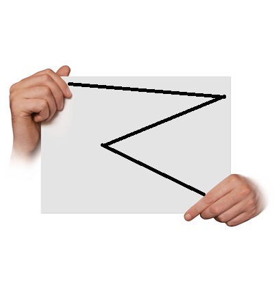
Research shows that users first focus on the top left corner of the screen when looking at the screen.
("Z-shaped pattern for reading")
It is therefore advisable to display the most important information here, for example the current machine status or the last alarm.
If relevant to our visualization, let's take cultural differences into account when designing the layout.
In countries where users read from left to right, the most important elements should be placed on the left-hand side of the layout, while in countries where people read from right to left, the opposite may be the case.
Users are usually reluctant to get used to a new layout and a new operating philosophy, which means that changes may be undesirable in the future.
Therefore, it's advisable to think about long-term consistency when designing the layout and navigation.
We should try to design a layout that is sustainable in the long term and remains flexible for future adjustments.
© Radim-Automation, 2020–2026. All rights reserved.
Sharing of this article is permitted with proper attribution (link to the original page).
Related previous articles:
- HMI layout and correct display size
- Choosing an HMI display
- HMI is not a web page
- HMI - Don't overdo it with complex design
- HMI - Have a consistent style
- High Performance HMI
- Graphic designer
- Talk to operators
- Clear signals
- Design considerations for effective HMIS
- Modular software architecture
- Hardware concept
- Design machines with a focus on user's abilities and needs
- Collect all the requirements and sort them!
- Who will operate?
- Functional and intuitive HMI
- HMI and PLC applications should grow together
- More than just start and stop
- Safety first!
- Don't make it worse!
- Introduce the terminology and standardize it!
- Industrial evolution - Listen to your customers and follow new trends!
- Stay alert!
- What does the customer need?
- Don't disappoint your customer!
- Ask questions!
- Check the result!
- Keep it simple!
- Choose the right tool!
- Development is evolution
- Transparency and reliability
- From an idea to a consistent system
Related next articles:
- HMI navigation
- HMI - back and forward navigation buttons
- HMI – Don't hide anything
- HMI - annoying pop-up windows
- What makes an HMI intuitive?
- HMI - light versus dark design
Comment#: 00001
Date: 2024-10-31
User: Radim
"Before designing any screen it is useful to understand how a user will use it. Generally, users will scan a screen in the same way as they would scan a page in a magazine, which in the west means from the top left corner to the right and reading down the screen.
In taking this into account, the display designer should ensure that important items should be on the 'scan' line. Alarms should therefore be across the top of the page, key data in center right and maybe buttons and controls on the lower right. Whilst supporting graphics and the company logo are better placed on the lower left of the screen."
- https://www.hexatec.co.uk/Legacy/Consultancy/hmi_display_design_guidelines.aspx
Comment#: 00002
Date: 2024-11-15
User: Radim
"The plain fact is users will not read nothing you put on the screen.
Users will only read the absolute minimum amount of text on the screen necessary to complete their task.
Think long and hard about placing things directly in front of them, where they are not just visible, but anavoidable. Otherwise they might not be seen at all.
Put the most important content at as close to the top of the page as you can."
- Jeff Atwood. Hyperink (2012). Effective Programming: More Than Writing Code.
Comment#: 00003
Date: 2025-02-18
User: Radim
Why is the hamburger menu not ideal for industrial visualization?
Recently, the hamburger menu has become increasingly common in industrial HMI systems. While this element is widely used in mobile and web applications, it may not be the best choice for industrial visualization.
The main drawback is that it hides important control elements (buttons) and requires an extra click. Users first have to open the menu before selecting the desired function. This reduces efficiency and can be a problem, especially in environments where speed and clarity are crucial.
A better solution is a fixed toolbar with the key control elements (buttons). It provides immediate access to essential functions, improves user orientation, and reduces the time needed to perform an action. Of course, this should be considered already at the beginning of the project - especially when choosing a sufficiently large display that allows a clear arrangement of the control elements on the screen.
Do you use a hamburger menu in your HMI systems, or do you prefer fixed toolbar with the most important buttons?